Bar Charts vs. Candlestick Charts – Which is Better?
When you’re working in the stock trading industry you are going to want to learn how to analyze and read charts. This is a basic practice that all traders need to know if they want to find any success in the stock market. It is even truer for day traders or traders who work from their home computer. Because they don’t have the big board like you’d see in the pit, they are at a disadvantage. To help you become more profitable, you need to identify patterns quickly and the best to achieve that is through various charts.
However, there are a few charts you can use when it comes to trading analysis and you may have seen some of the common ones before. The two most frequently used charts in the trading industry are the bar chart and the candlestick chart. These can tell you a lot of information if you know what you’re looking at, helping you make a profit on the stock market.
But which one is better out of the bar chart and candlestick chart when it comes to technical analysis? There is a debate as to which one is more useful but, at the end of the day, it is up to personal preference. This article will explore the differences between the two and will try to decipher which one is better to use.
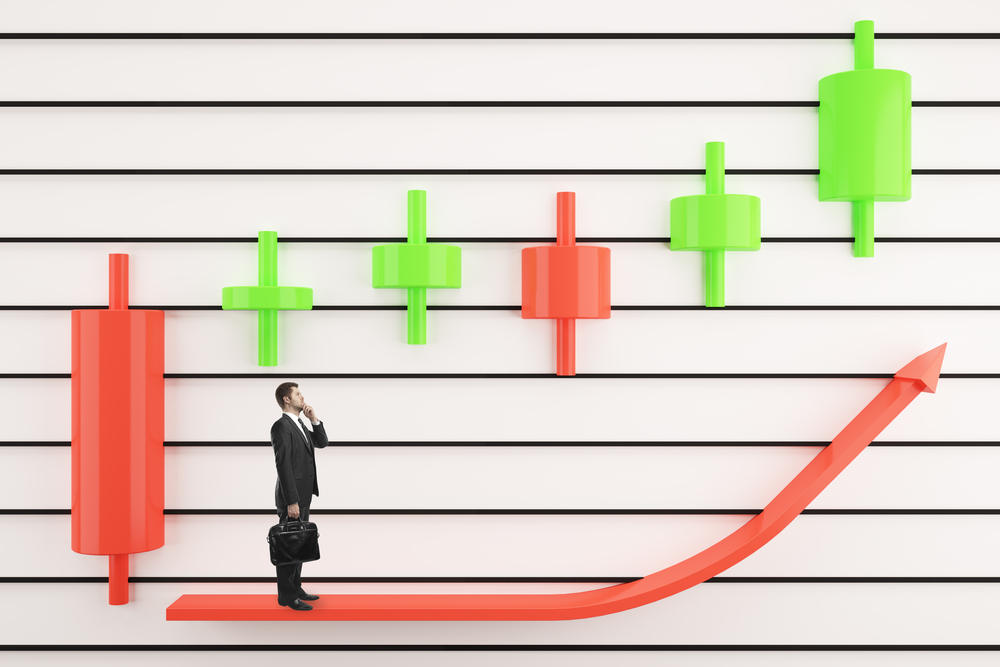
Candlestick Charts
Candlestick charts were first used by Japanese rice traders in the 1800s and are now use in the stock trading industry. They are an effective way to visualize the data of a commodity or security. They are formed by what are known as bodies and shadows. The bodies in a candlestick chart represent the range of the open/close price for that day, these are colored in green and red to give an emotional visualization. The shadows state the range for the day outside of the closing and opening prices.
Bar Charts
Bar charts are similar to candlestick charts but don’t have the visual representations with the colours. They still show the price range of a selected commodity or security. The range that is being analyzed can be as long or as short as you want it to be, being anywhere from a year to a minute. There is also a tick on either side of the chart indicating the opening price and the closing price. This chart is more basic and shows the highs and lows in a simpler fashion.
Conclusion
Right, so getting on to which is better. The choice is honestly the result of preference. Both of the charts actually show no less or no more information and can still provide you with adequate technical analysis. The only thing you have to decide on is what you prefer to look at. If you prefer to go on highs and lows, the bar chart is for you, but if you like the visual representation of the opens and closes in a commodity, you may be better off going with a candlestick chart. Try out both and see what you think.